Plan Your Device Strategy
As mobile gains ever more ground and mobile first continues to be knocked around as the design strategy for the web, I encourage people to look at their use statistics. Although mobile first is a great strategy if you don’t have statistics to draw upon for your site, or your reorganization needs a mobile injection, nothing will serve you better than the statistics regarding what your user does on your site.
Instead of simply adopting an oversimplified “mobile first” strategy, I decided it would be best to figure out what the user is doing in each mobile context. For the simple sake of reason, I generally say we have three platforms and four positions to deal with. Either your user is on a small-profile device like a phone or palm-top computing device, they are on a tablet, or they are on a standard computing device.
This gives us something really easy to work with. There are three devices, two of which have two orientations. It might seem like this translates to 5 total designs to commit to. Fortunately, the phone in landscape is just about the same width as the tablet in portrait. We are left with four design contexts to worry about. Realistically, though, we can start with just three pieces of the puzzle and extrapolate the intermediate fourth.
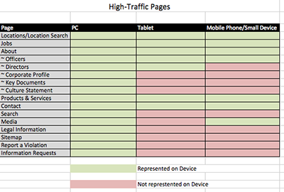
My latest project, for which I am leading a team, needs two key items to make sense of the high-priority items on the site: device used and pages accessed. After a bit of careful fiddling, I uncovered the following chart:
[caption id=”” align=”aligncenter” width=”400”] Device to Traffic Chart[/caption]
This chart helped me to figure out what our device strategy would be. Clearly our visitors from mobile devices have much more limited interests than those visiting from a standard computer interface. Mobile first means we should guess at what should go on a site and what the user will want to do on a smaller device. By analyzing the data, we can clearly define interactions on mobile devices which may, actually, not be important to highlight on the desktop.
Instead of working with mobile as a pared down version of a complete site, we should aim to understand what a user wants to accomplish in a different context. This is not a cut and dried rule of thumb but something we can produce through a little bit of careful reflection on what users are doing right now.
For your next project, instead of taking a mobile-first design stance, review your user data and serve users in each platform according to their needs. Provide clear signposts for your users. Develop a device strategy and make the web a better place.